
Some of the most important words in a film are not spoken. A date that opens the story, a location stamp, a newspaper headline, a warning sign on a door, a note left on a pillow: all of it is text the audience reads on screen, and all of it has to be written into the screenplay.
This guide explains how to write on-screen text in a screenplay, including SUPER and title cards, INSERT shots of letters and signs, chyrons and news tickers, and screens inside the scene. You will see examples of each format and the mistakes that make readers stumble.
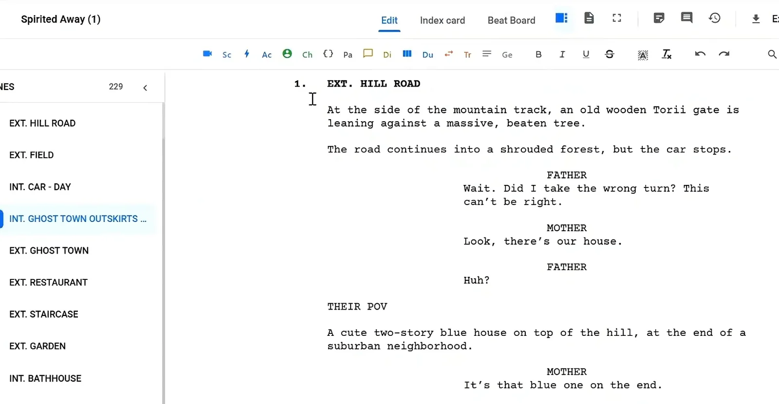
Here is a short Studiovity video on the screenplay editor, which handles headings, action and dialogue formatting while you write:
Why On-Screen Text Needs Clear Formatting
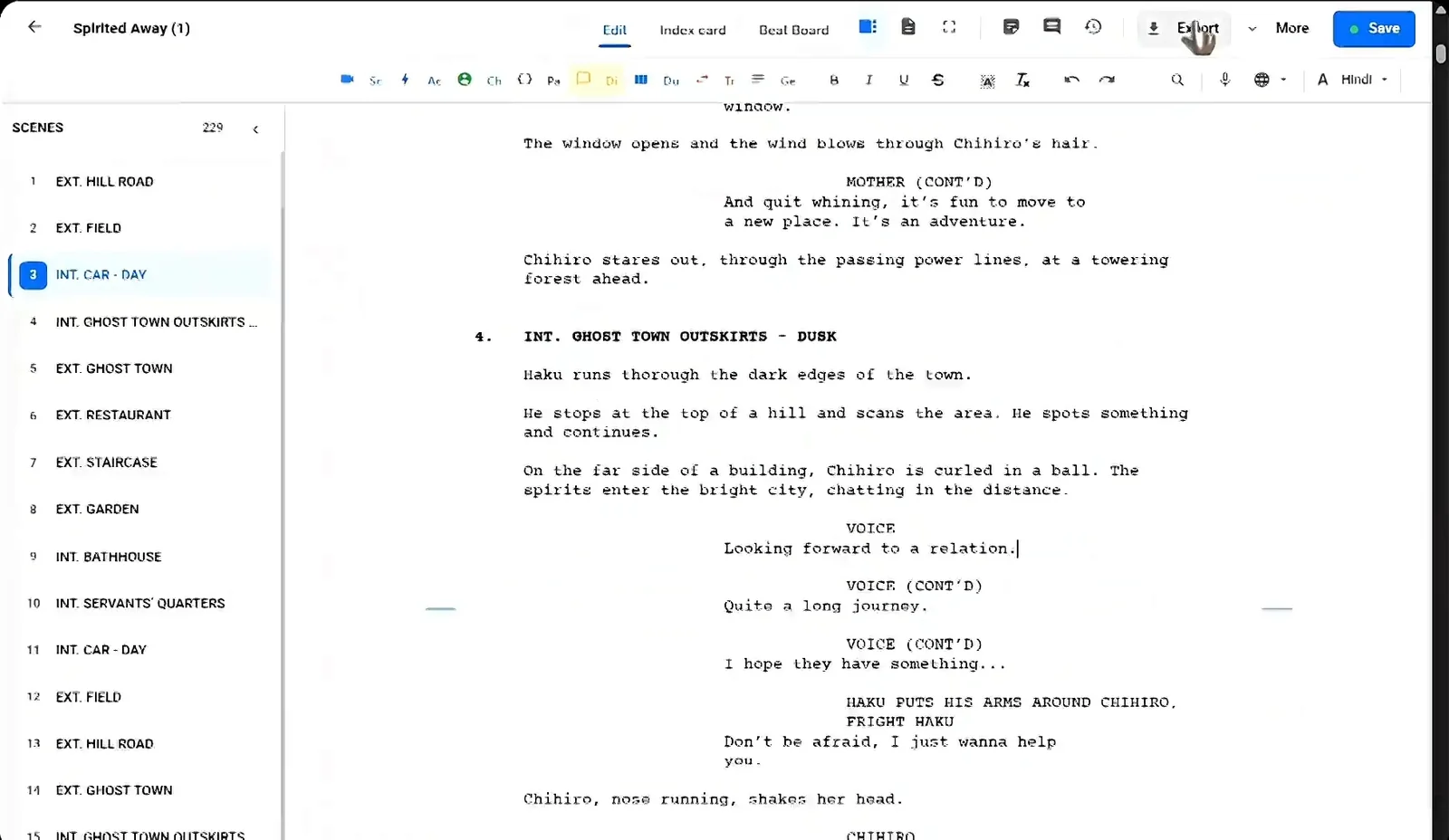
A screenplay is read by many people before it is shot. The director needs to know what the audience sees, the editor and graphics team need the exact wording, and the art department needs to know which props carry writing. If on-screen text is buried in a paragraph of action, it is easy to miss. Clear, consistent formatting makes it impossible to miss, and a screenplay editor with automatic formatting keeps those devices in the same style on every page.
SUPER: Text Over Picture
SUPER, short for superimpose, is the most common way to show text laid over an image. Use it for dates, places, times and short context.
EXT. MUMBAI HARBOUR - DAWN

Fishing boats rock against the dock.

SUPER: "MUMBAI, 1993"
Put the exact words in quotes so there is no doubt about the wording. Some writers write SUPERIMPOSE: or TITLE OVER: instead. Pick one style and use it for the whole script.
Title Cards: Text on Its Own Screen
A title card is text on a plain background, usually black, with no picture behind it. It is useful for chapter titles, epigraphs or a short historical note at the start of a film.
BLACK SCREEN.

TITLE CARD: "Part One - The Debt"
Use title cards sparingly. Two or three in a feature can give it shape. A dozen can make it feel like a slideshow.
INSERT: Letters, Signs and Objects
When the camera needs to show a piece of writing up close, such as a letter, a sign, a label or a photograph with a caption, use an INSERT. It tells the reader we cut to a close view of the object, and BACK TO SCENE brings us out again.
Arjun opens the envelope with shaking hands.

INSERT - THE LETTER

"We regret to inform you that your application has been rejected."

BACK TO SCENE

Arjun crumples it into his pocket.
For a sign that the audience simply notices, you do not always need an INSERT. A clear action line such as A hand-painted sign reads: “NO ENTRY AFTER DARK.” is enough.
Chyrons, Tickers and Screens Inside the Scene
Modern stories are full of screens: TV news, laptops, CCTV monitors and phones. When a character watches a news report, describe the ticker or chyron in the action line and quote the words.
On the TV, a NEWS ANCHOR speaks over a red banner: "BREAKING: DAM GATES OPENED."
For a laptop or computer screen, describe what matters to the story, not every icon. If a character is typing a message, show only the line the audience needs to read. Text messages and calls have their own conventions, which we cover in our guide on how to write a phone call in a screenplay.
Subtitled Dialogue
If a character speaks a language the audience will read as subtitles, write the dialogue in English and add a short note so everyone knows it will appear as text on screen, for example a parenthetical such as (in Tamil; subtitled). For long stretches, state the rule once in an action line, then write the dialogue normally until it changes.
If you want to try these formats on a real page, open the Studiovity screenwriting editor and write one SUPER, one INSERT and one screen description in a test scene.
Tips for Writing On-Screen Text
Keep it short
Audiences have only a few seconds to read. Aim for one short line. If the text needs a paragraph, it probably belongs in a scene.
Quote the exact wording
Graphics teams copy what you write. Put the final words in quotes and check spelling, names and dates.
Use caps for the device, not the text
Write SUPER, INSERT and TITLE CARD in caps so they stand out, but write the quoted text the way it should appear on screen.
Let text do story work
A date can create dread, an ironic sign can add humour, and a two-word note can end a scene. Treat on-screen text as storytelling, not decoration.
Stay consistent
Choose one convention for each type of text and keep it from page one to the last page. Consistency is what makes a script feel professional.
Common Mistakes With On-Screen Text
- Hiding a key note or sign in the middle of a long action paragraph.
- Paraphrasing the text instead of quoting it, which leaves the wording to guesswork.
- Using SUPER for long explanations that should be dramatised.
- Mixing styles, such as SUPER on one page and TITLE OVER on the next.
- Forgetting BACK TO SCENE after an INSERT, so the reader is unsure where the camera is.
For the basics of scene headings, action and transitions that sit around your on-screen text, see the complete screenplay formatting guide.
FAQ
Is SUPER the same as a title card?
No. SUPER places text over an image. A title card shows text on its own background with no picture.
Do I need to describe the font or design of on-screen text?
Usually not. Leave design to the director and graphics team unless the look is essential to the story.
How do I show a handwritten note?
Use an INSERT or a clear action line, quote the words, and mention that it is handwritten if that matters.
Write On-Screen Text Clearly in Studiovity
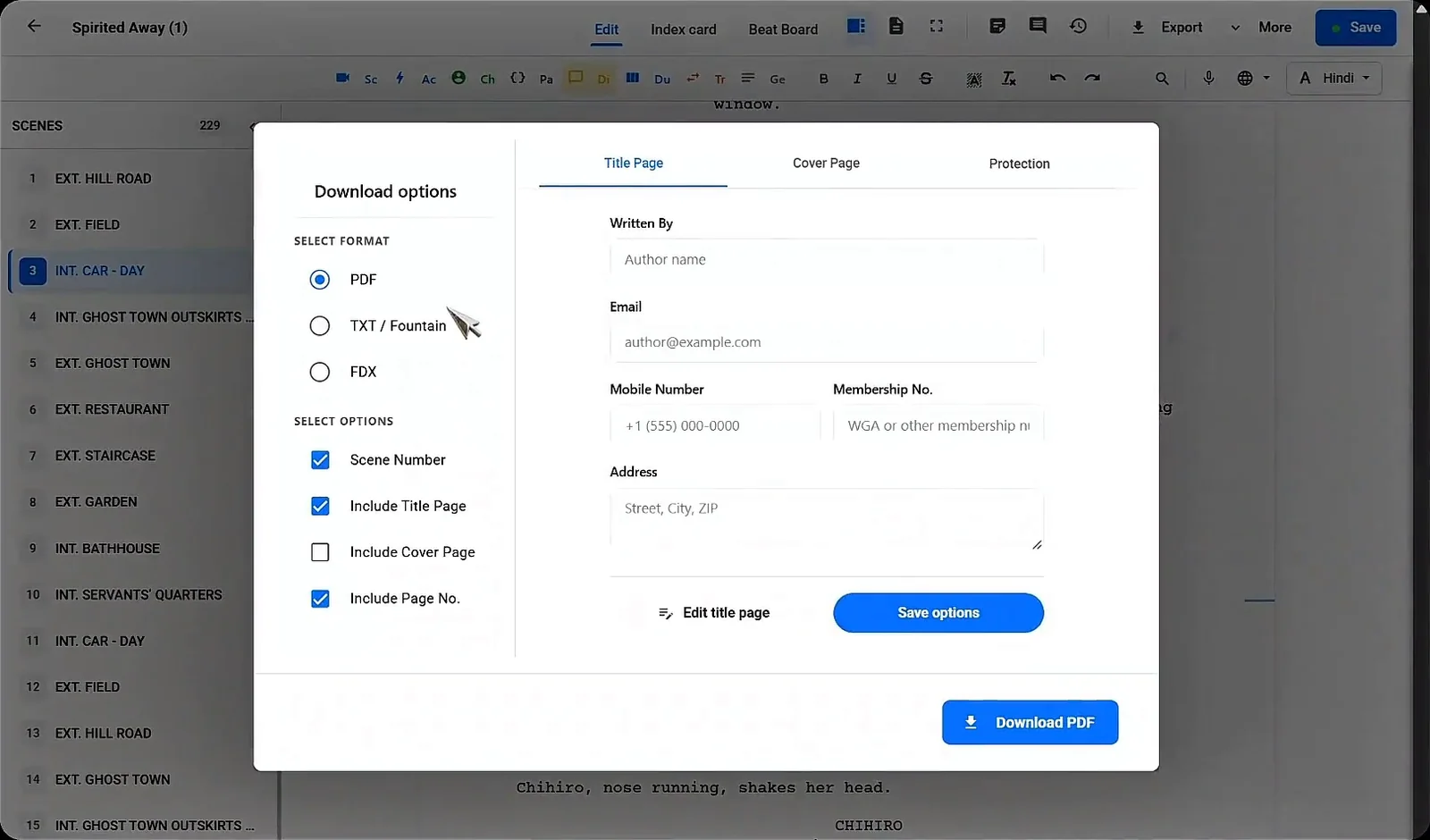
Clean on-screen text makes your script easier to read, budget and shoot. Studiovity gives you an auto-formatting editor, a scene list to jump between pages, and export to PDF, Fountain or FDX when the draft is ready. Start your screenplay in Studiovity and make every word on screen count.